- Products
- Learn
- Local User Groups
- Partners
- More
This website uses Cookies. Click Accept to agree to our website's cookie use as described in our Privacy Policy. Click Preferences to customize your cookie settings.
- Products
- Learn
- Local User Groups
- Upcoming Events
- Americas
- EMEA
- Czech Republic and Slovakia
- Denmark
- Netherlands
- Germany
- Sweden
- United Kingdom and Ireland
- France
- Spain
- Norway
- Ukraine
- Baltics and Finland
- Greece
- Portugal
- Austria
- Kazakhstan and CIS
- Switzerland
- Romania
- Turkey
- Belarus
- Belgium & Luxembourg
- Russia
- Poland
- Georgia
- DACH - Germany, Austria and Switzerland
- Iberia
- Africa
- Adriatics Region
- Eastern Africa
- Israel
- Nordics
- Middle East and Africa
- Balkans
- Italy
- Bulgaria
- Cyprus
- APAC
- Partners
- More
- ABOUT CHECKMATES & FAQ
- Sign In
- Leaderboard
- Events
Step Into the Future of
AI-Powered Cyber Security
The State of Ransomware Q1 2026
Key Trends and Their Impact
AI Security Masters E8:
Claude Mythos: New Era in Cyber Security
Blueprint Architecture for Securing
The AI Factory & AI Data Center
Call For Papers
Your Expertise. Our Stage
CheckMates Go:
CheckMates Fest
Turn on suggestions
Auto-suggest helps you quickly narrow down your search results by suggesting possible matches as you type.
Showing results for
- CheckMates
- :
- Products
- :
- General Topics
- :
- Re: BEYOND - Customer Success Hub
Options
- Subscribe to RSS Feed
- Mark Topic as New
- Mark Topic as Read
- Float this Topic for Current User
- Bookmark
- Subscribe
- Mute
- Printer Friendly Page
Turn on suggestions
Auto-suggest helps you quickly narrow down your search results by suggesting possible matches as you type.
Showing results for
Are you a member of CheckMates?
×
Sign in with your Check Point UserCenter/PartnerMap account to access more great content and get a chance to win some Apple AirPods! If you don't have an account, create one now for free!
- Mark as New
- Bookmark
- Subscribe
- Mute
- Subscribe to RSS Feed
- Permalink
- Report Inappropriate Content
Jump to solution
BEYOND - Customer Success Hub
Hi all,
as you have probably mentioned, Check Point has changed the look and feel of Support Portal. If you are opening a new request or working with existing ones, you are now using our new Support tool called BEYOND.
Guided tool for this tool is available here.
Should you have any comments and suggestions, please feel free to express them in the comments.
UPDATE:
Thank you very much for the feedback
Just to provide an update on some of the issues reported:
- Customers now can see the details of the migrated SRs - all the migrated SRs allow View Previous Updates that show the updates, activities, and attachments.
- Users now can access all tickets on the accounts they are connected to (regardless if they or others opened these tickets).
- RMAs should be working now
1 Solution
Accepted Solutions
- Mark as New
- Bookmark
- Subscribe
- Mute
- Subscribe to RSS Feed
- Permalink
- Report Inappropriate Content
Thank you for your feedback Ashley,
We are aware of the challenges related to the migration to the new platform, and we are working around the clock to address each of the reported issues.
Regrading the SRs that you think are missing ,we'd appreciate it if you could send us specific examples with SR to beyond@checkpoint.com
Sorry for any inconvenience caused due to the transition.
161 Replies
- Mark as New
- Bookmark
- Subscribe
- Mute
- Subscribe to RSS Feed
- Permalink
- Report Inappropriate Content
I am blind (maybe) - in the ticket, i can only see the first case details from opening and my last comments - but no more updates from last two month and no attachements. Is that a known issue or a feature ?
CCSP - CCSE / CCTE / CTPS / CCME / CCSM Elite / SMB Specialist
- Mark as New
- Bookmark
- Subscribe
- Mute
- Subscribe to RSS Feed
- Permalink
- Report Inappropriate Content
Yes, the same for me. In place where old updates should be, there is nothing...
- Mark as New
- Bookmark
- Subscribe
- Mute
- Subscribe to RSS Feed
- Permalink
- Report Inappropriate Content
Thank you very much for the feedback
We are working diligently on addressing this issue and we hope to have a solution by the end of the day.
- Mark as New
- Bookmark
- Subscribe
- Mute
- Subscribe to RSS Feed
- Permalink
- Report Inappropriate Content
Its good to see some formatting of fonts and emojis in case "Update" option.
- Mark as New
- Bookmark
- Subscribe
- Mute
- Subscribe to RSS Feed
- Permalink
- Report Inappropriate Content
I like that the drop down buttons have Wrap Text option in order to see all text in full length.
Also the Change Case Owner is an interesting feature. I can assign all my cases to anyone. Check Point employees and other Check Point user accounts. Hmm..
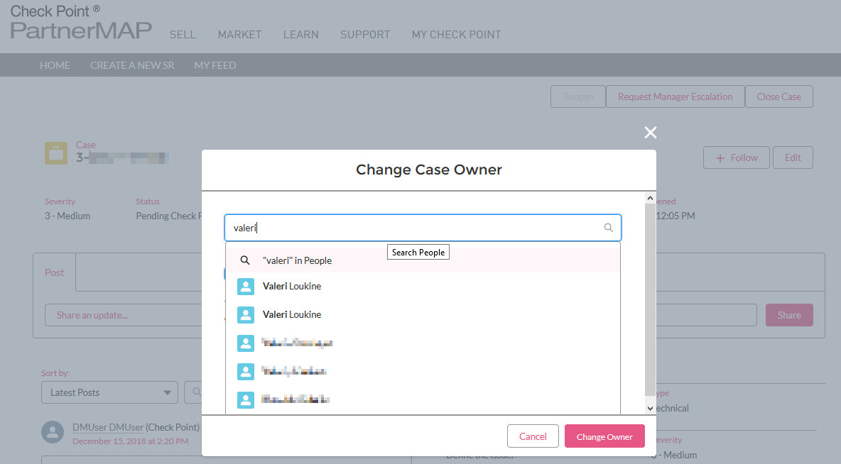
What I don't like about this -Feature- is that anyone can just enter the name of a Check Point partner and see the clear text names of all that partners emloyees having a Check Point UserCenter account. This is confidential and should not be viewable for just everyone who'd like to know.
- Mark as New
- Bookmark
- Subscribe
- Mute
- Subscribe to RSS Feed
- Permalink
- Report Inappropriate Content
That is not the only place you now can see detailed information not formerly available ![]() - but we also find a lot of empty lists and links...
- but we also find a lot of empty lists and links...
CCSP - CCSE / CCTE / CTPS / CCME / CCSM Elite / SMB Specialist
- Mark as New
- Bookmark
- Subscribe
- Mute
- Subscribe to RSS Feed
- Permalink
- Report Inappropriate Content
Fixed
- Mark as New
- Bookmark
- Subscribe
- Mute
- Subscribe to RSS Feed
- Permalink
- Report Inappropriate Content
Thank you very much for the feedback.
This issue is now fixed.
- Mark as New
- Bookmark
- Subscribe
- Mute
- Subscribe to RSS Feed
- Permalink
- Report Inappropriate Content
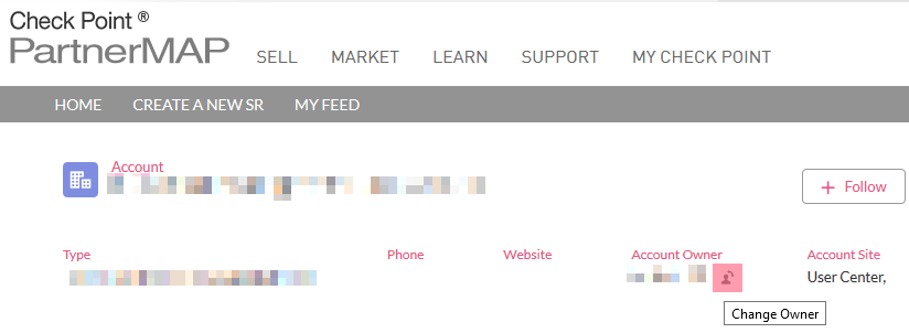
The issue is not fixed. There are many places where you can still click the change owner button (see below). Instead removing these links I suggest fixing the routines that allows accessing any confidential information.
- Mark as New
- Bookmark
- Subscribe
- Mute
- Subscribe to RSS Feed
- Permalink
- Report Inappropriate Content
Thank you Danny,
We are checking this.
- Mark as New
- Bookmark
- Subscribe
- Mute
- Subscribe to RSS Feed
- Permalink
- Report Inappropriate Content
Second, you can not open a ticket as a CCSP - every opened ticket goes under the CCSP UserCenter Account, but not the customers UC ! Not very important, really - only that the customer is unable to see the opened SR# in his UserCenter anymore 😞
CCSP - CCSE / CCTE / CTPS / CCME / CCSM Elite / SMB Specialist
- Mark as New
- Bookmark
- Subscribe
- Mute
- Subscribe to RSS Feed
- Permalink
- Report Inappropriate Content
I just have opened a new SR# and i succeeded in opening it for the customer UC - in the third field the UC Account# works, but intermediate display is wrongly showing the CCSP UserCenter Account...
CCSP - CCSE / CCTE / CTPS / CCME / CCSM Elite / SMB Specialist
- Mark as New
- Bookmark
- Subscribe
- Mute
- Subscribe to RSS Feed
- Permalink
- Report Inappropriate Content
I'm not sure if sending updates through email reply working fine, as I received:
===
Subject: Please Contact Us via 'Beyond' - Check Point's Customer Success Hub
Dear Sender,
In order to communicate with Check Point Technical Support over new or existing Service Requests, please login to
'Beyond' - Our Customer Success Hub.
Thank you, and we look forward to serving you.
Check Point Technical Services
24×7 Technical Support
Americas: +1-972-444-6600 / +1-888-361-5030 (Toll Free)
International: +44-114-478
===
- Mark as New
- Bookmark
- Subscribe
- Mute
- Subscribe to RSS Feed
- Permalink
- Report Inappropriate Content
Thank you very much for the feedback
You should be able to reply any email coming from the new system (from Dec 16th) or to update the Service Request using the post.
- Mark as New
- Bookmark
- Subscribe
- Mute
- Subscribe to RSS Feed
- Permalink
- Report Inappropriate Content
The biggest trouble is that also the SR#s got changed - e.g. 3-0558297121 has turned into 6-0000739006 ![]() making much work in our ticket system that is not able to recognize it anymore. I am really glad that christmas holydays will come very soon and i can forget about all that...
making much work in our ticket system that is not able to recognize it anymore. I am really glad that christmas holydays will come very soon and i can forget about all that...
CCSP - CCSE / CCTE / CTPS / CCME / CCSM Elite / SMB Specialist
- Mark as New
- Bookmark
- Subscribe
- Mute
- Subscribe to RSS Feed
- Permalink
- Report Inappropriate Content
It still doesn't work. I did reply to email for new SR (including all tags) and in your "better" portal I can see only such thing:
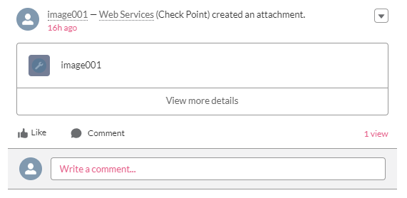
I cannot see also updates from engineer.
It isn't a facebook it should work and be easy, efficient and looks simple as much as possible.
I'm sorry but your current portal looks like a messy piece of something similar to social networking portal instead of professional support portal.
I cannot believe that you decided to do tests on partners / customers just before the hottest period of year.
If you really interested in I can send you some screenshots showing how proffesional support portal should look like and behave.
- Mark as New
- Bookmark
- Subscribe
- Mute
- Subscribe to RSS Feed
- Permalink
- Report Inappropriate Content
I cannot agree more!
The portal is lacking some kind of a relevant history overview.
- Mark as New
- Bookmark
- Subscribe
- Mute
- Subscribe to RSS Feed
- Permalink
- Report Inappropriate Content
only one question: how you guys test it before implementing it to production environment? why you cannot leave old page and add new one as second link? we cannot create new SR - no errors, just loading page, we cannot see old updates in previously created SRs.
But it'a great success that we can use EMOJIS now, really appreciate it, now we can use pictures to explain checkpoint troubles. HUGE success![]()
![]()

- Mark as New
- Bookmark
- Subscribe
- Mute
- Subscribe to RSS Feed
- Permalink
- Report Inappropriate Content
Thank you very much for the feedback ![]()
We are working diligently on addressing this issue and we hope to have a solution by the end of the day.
- Mark as New
- Bookmark
- Subscribe
- Mute
- Subscribe to RSS Feed
- Permalink
- Report Inappropriate Content
No changes. Did you mean "this year"?
I think you should test before release and not break old support center (which works correctly).
- Mark as New
- Bookmark
- Subscribe
- Mute
- Subscribe to RSS Feed
- Permalink
- Report Inappropriate Content
i think Checkpoint no longer have a QA team, they simply wait for customers to test out their software ![]()
- Mark as New
- Bookmark
- Subscribe
- Mute
- Subscribe to RSS Feed
- Permalink
- Report Inappropriate Content
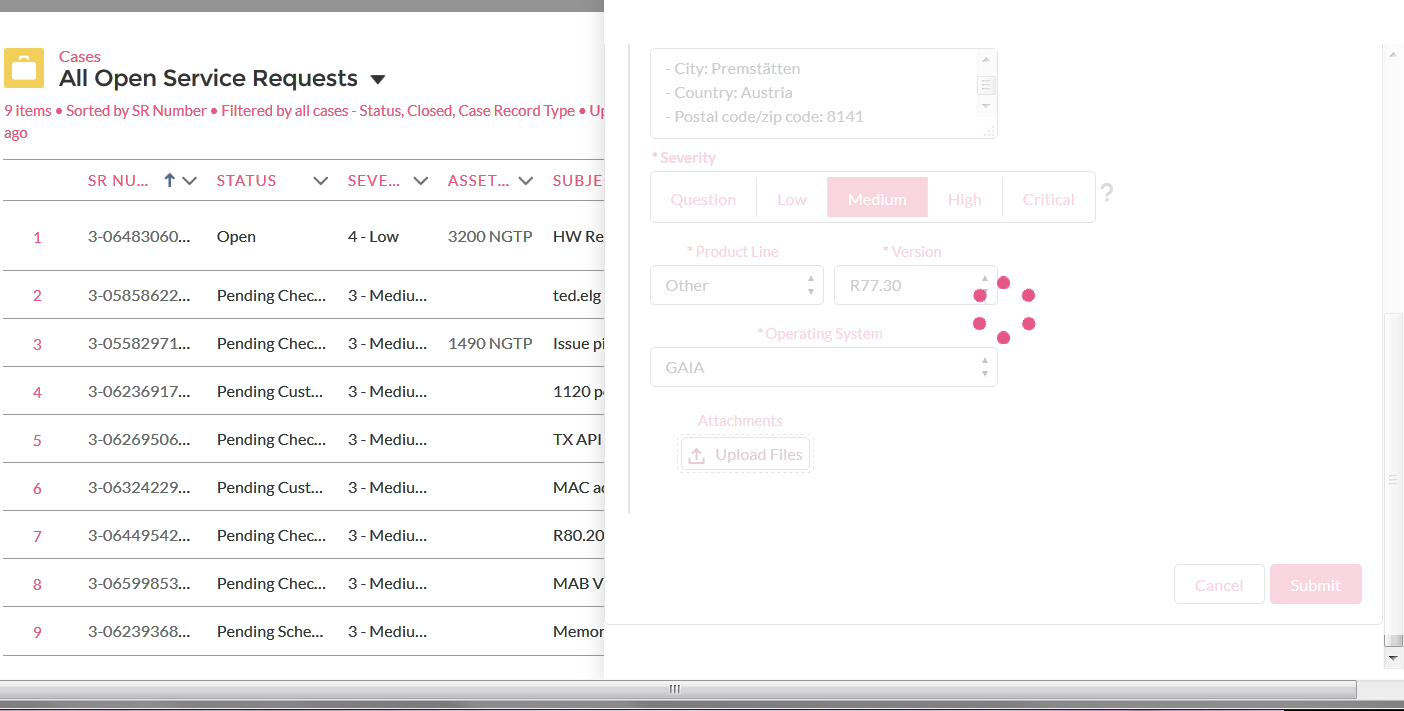
The default 'Recently Viewed' list on the home screen is ok, the entries on the list are readable, and you can find the one you want easily. On the other hand, The 'All Open Service Requests' view is a bit of a mess, with most of the fields truncated to the point that they're not that useful. (On further inspection, all except the two 'recently' ones are like this).
On the create new SR page, the UC account dropdown is... odd. It is giving me a choice of three chosen customer UC accounts and 'Other', with no particular idea why those three accounts specifically were chosen? Odd.
Asset dropdown is mostly ok, but might be nice to include the device hostname if available.
The walkthrough video/slideshot thing indicates that the dropdowns should automatically filter based on other information entered, this doesn't seem to be the case in at least some instances - e.g. select R80.20, get offered Splat & Windows as options. (Although maybe it only takes the 'Product Line' bit into account for this, and ignores the version).
There are a few instances as well where a mouseover box causes the underlying page to shift around which is a bit annoying, but not a major problem.
The lack of history within a ticket (as mentioned further up the thread) is probably the biggest problem, especially when picking up tickets from colleagues half way through.
- Mark as New
- Bookmark
- Subscribe
- Mute
- Subscribe to RSS Feed
- Permalink
- Report Inappropriate Content
Also the button to add an update to a ticket being labelled 'Share'... just feels a bit wrong for some reason.
- Mark as New
- Bookmark
- Subscribe
- Mute
- Subscribe to RSS Feed
- Permalink
- Report Inappropriate Content
Further feedback on the 'Create a New SR' page:
That UC Account drop down really is quite odd. It seems that if the relevant account is not on the list, you ahve to completely ignore that whole line, and go through the search boxes underneath, which seems to be an either/or thing, i.e. if you put in an asset, it just ignores the UC account and replaces it with 'Other', and if you put in a UC account, it ignores whatever is in the asset search box - which is pretty much the same as the old system - except there was a radio button there that made it clear it was an either/or thing.
And I've no idea what criteria is used to decide what items go on the upper level UC/Asset drop down lists.
Under contact information, the contact time window seems to be fixed at a 5 hour window, where only the start can be specified. (Don't get me wrong.... a 5 hour working day sounds fine to me!! ![]() )
)
- Mark as New
- Bookmark
- Subscribe
- Mute
- Subscribe to RSS Feed
- Permalink
- Report Inappropriate Content
And it seems to be opening two tickets with different SR numbers? Once for ITAC and once for DTAC? Odd, but possibly a time zone thing?
- Mark as New
- Bookmark
- Subscribe
- Mute
- Subscribe to RSS Feed
- Permalink
- Report Inappropriate Content
I just spent a lot of time trying to open RMA ticket - that is is no longer possible ! After trying RMA, Tech ticket and chat in vain i will now phoneCP ![]()
CCSP - CCSE / CCTE / CTPS / CCME / CCSM Elite / SMB Specialist
- Mark as New
- Bookmark
- Subscribe
- Mute
- Subscribe to RSS Feed
- Permalink
- Report Inappropriate Content
On the phone, the CP engineer was able to replicate the issue while trying to open a SR# for RMA - he also failed and has opened an internal ticket for the iinterface issue. Now i am only still waiting for the RMA to get opened ![]()
CCSP - CCSE / CCTE / CTPS / CCME / CCSM Elite / SMB Specialist
- Mark as New
- Bookmark
- Subscribe
- Mute
- Subscribe to RSS Feed
- Permalink
- Report Inappropriate Content
My RMA case is still not open and i do not know what to tell the customer ![]()
CCSP - CCSE / CCTE / CTPS / CCME / CCSM Elite / SMB Specialist
- Mark as New
- Bookmark
- Subscribe
- Mute
- Subscribe to RSS Feed
- Permalink
- Report Inappropriate Content
We have decided to put much pressure on the local CP SE - not to be able to open RMA for our customers is just s... This makes for a really very very bad end-of-year feeling ![]()
CCSP - CCSE / CCTE / CTPS / CCME / CCSM Elite / SMB Specialist
Leaderboard
Epsum factorial non deposit quid pro quo hic escorol.
| User | Count |
|---|---|
| 5 | |
| 4 | |
| 4 | |
| 3 | |
| 3 | |
| 3 | |
| 3 | |
| 3 | |
| 2 | |
| 2 |
Upcoming Events
Tue 12 May 2026 @ 10:00 AM (CEST)
The Cloud Architects Series: Check Point Cloud Firewall delivered as a serviceWed 13 May 2026 @ 11:00 AM (EDT)
TechTalk: The State of Ransomware Q1 2026: Key Trends and Their ImpactThu 14 May 2026 @ 07:00 PM (EEST)
Under the Hood: Presentando Check Point Cloud Firewall como ServicioTue 12 May 2026 @ 10:00 AM (CEST)
The Cloud Architects Series: Check Point Cloud Firewall delivered as a serviceAbout CheckMates
Learn Check Point
Advanced Learning
YOU DESERVE THE BEST SECURITY
©1994-2026 Check Point Software Technologies Ltd. All rights reserved.
Copyright
Privacy Policy
About Us
UserCenter


