- CheckMates
- :
- Products
- :
- Quantum
- :
- Management
- :
- Buggy Widgets
- Subscribe to RSS Feed
- Mark Topic as New
- Mark Topic as Read
- Float this Topic for Current User
- Bookmark
- Subscribe
- Mute
- Printer Friendly Page
Are you a member of CheckMates?
×- Mark as New
- Bookmark
- Subscribe
- Mute
- Subscribe to RSS Feed
- Permalink
- Report Inappropriate Content
Buggy Widgets
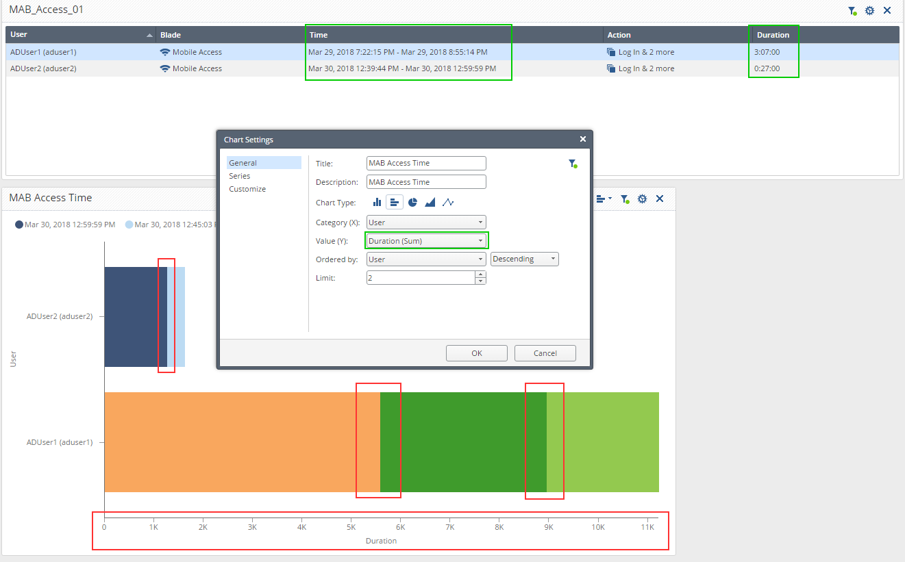
There is a surprising lack of any custom reports for Check Point SmartEvent. I suspect this is partially due to the lack of good tutorials with samples provided.
Trying to create a custom report I've bumped in this situation:
1. I can see no way not to split the graphs in a different color bands. I like to have this option, but to exercise it when needed.
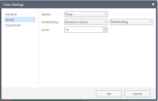
2. The Duration (Sum) is correctly shown in the Statistical Table on top, but for some reason shows traffic volume in a chart. The Series in the chart is defined as:
- Mark as New
- Bookmark
- Subscribe
- Mute
- Subscribe to RSS Feed
- Permalink
- Report Inappropriate Content
So with "Duration" graph being buggy, I am trying to implement the workaround using "Hours of Day":
Can someone tell me if it is possible to have it show a single color bar instead of looking like a painter's folio?
Incidentally: this is a depiction of a one session over time.
- Mark as New
- Bookmark
- Subscribe
- Mute
- Subscribe to RSS Feed
- Permalink
- Report Inappropriate Content
HI,
I created the same widgets as yours:
If you don't want the chart to be divided into series, keep it set to None.
The values shown on the chart are actually the number of seconds - i.e. in my example (250 * 60 + 14) * 60 = 900,000
I agree it should be presented as time values. We will fix it.
If you want all bars to be with fixed color, you can change it under the Customize topic.
The "time range" you used on the table, is the min and max values of this field. in your case is the time of the first and the last logs, and these are not the same as the duration. For example, there can be a single log to report on user activity of a few hours.
- Mark as New
- Bookmark
- Subscribe
- Mute
- Subscribe to RSS Feed
- Permalink
- Report Inappropriate Content
Kfir,
Thank you for looking into this and for the explanation of color graph manipulation.
Please let me know when the updated widget "Duration" parameter will become available.
As to "Time Range" in the table, any suggestions as to alternatives?
The goal is to get users' remote access statistics daily report (at a minimum) and possibly a monthly and annual summaries.
Regards,
Vladimir
- Mark as New
- Bookmark
- Subscribe
- Mute
- Subscribe to RSS Feed
- Permalink
- Report Inappropriate Content
The duration will probably be fixes in the next version.
As for "Time range", what exactly do you expect to get. i.e. I was connected from 08:00-10:00 and from 14:00-15:30.
- Mark as New
- Bookmark
- Subscribe
- Mute
- Subscribe to RSS Feed
- Permalink
- Report Inappropriate Content
Yes, exactly that, with the duration aggregating the total time of those sessions.
- Mark as New
- Bookmark
- Subscribe
- Mute
- Subscribe to RSS Feed
- Permalink
- Report Inappropriate Content
Duration is clear.
What about time range? Do you want to see 2 lines for each session, or one with time range 08:00-15:30?
- Mark as New
- Bookmark
- Subscribe
- Mute
- Subscribe to RSS Feed
- Permalink
- Report Inappropriate Content
I suppose it is too much to ask, but ideally, if it was a momentary session interruption, i would disregard it and if it was more than set number of minutes, I'd like to see multiple lines.
If what I am describing above is too complex, than multi-lines describing each session, but still under single instance of user name.