- Products
- Learn
- Local User Groups
- Partners
- More
This website uses Cookies. Click Accept to agree to our website's cookie use as described in our Privacy Policy. Click Preferences to customize your cookie settings.
- Products
- Learn
- Local User Groups
- Upcoming Events
- Americas
- EMEA
- Czech Republic and Slovakia
- Denmark
- Netherlands
- Germany
- Sweden
- United Kingdom and Ireland
- France
- Spain
- Norway
- Ukraine
- Baltics and Finland
- Greece
- Portugal
- Austria
- Kazakhstan and CIS
- Switzerland
- Romania
- Turkey
- Belarus
- Belgium & Luxembourg
- Russia
- Poland
- Georgia
- DACH - Germany, Austria and Switzerland
- Iberia
- Africa
- Adriatics Region
- Eastern Africa
- Israel
- Nordics
- Middle East and Africa
- Balkans
- Italy
- Bulgaria
- Cyprus
- APAC
- Partners
- More
- ABOUT CHECKMATES & FAQ
- Sign In
- Leaderboard
- Events
Step Into the Future of
AI-Powered Cyber Security
The State of Ransomware Q1 2026
Key Trends and Their Impact
AI Security Masters E8:
Claude Mythos: New Era in Cyber Security
Blueprint Architecture for Securing
The AI Factory & AI Data Center
Call For Papers
Your Expertise. Our Stage
CheckMates Go:
CheckMates Fest
Turn on suggestions
Auto-suggest helps you quickly narrow down your search results by suggesting possible matches as you type.
Showing results for
- CheckMates
- :
- Products
- :
- General Topics
- :
- Re: CPUSE (Deployment Agent) new GUI
Options
- Subscribe to RSS Feed
- Mark Topic as New
- Mark Topic as Read
- Float this Topic for Current User
- Bookmark
- Subscribe
- Mute
- Printer Friendly Page
Turn on suggestions
Auto-suggest helps you quickly narrow down your search results by suggesting possible matches as you type.
Showing results for
Are you a member of CheckMates?
×
Sign in with your Check Point UserCenter/PartnerMap account to access more great content and get a chance to win some Apple AirPods! If you don't have an account, create one now for free!
- Mark as New
- Bookmark
- Subscribe
- Mute
- Subscribe to RSS Feed
- Permalink
- Report Inappropriate Content
CPUSE (Deployment Agent) new GUI
Hi
A new Deployment Agent (build 2282) was lately released including a new GUI
Currently we support both old and new GUI so the default user interface had not been changed after this last update
We would highly appreciate if you use this opportunity to use the new interface by running "da_cli switch_gui" and share feedbacks with me (boazo@checkpoint.com)
It is planned to become the default GUI soon
If, for any reason, it is required to revert to old GUI simply run the same command again "da_cli switch_gui"
Waiting for feedbacks
Thanks
Boaz
20 Replies
- Mark as New
- Bookmark
- Subscribe
- Mute
- Subscribe to RSS Feed
- Permalink
- Report Inappropriate Content
Hi Boaz,
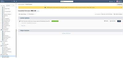
I' like to say that - more info - less info - is useless if it add one ore two lines to the list - i.e. Major Versions or Updates -
for me its confusing, because I can scroll the list very fast - and if there are one ore two lines instead of - more info - would be helpful
furthermore the Package Size can be on one line easily - like Package Size - XXXX.XX MB
Best Regards
Johann
- Mark as New
- Bookmark
- Subscribe
- Mute
- Subscribe to RSS Feed
- Permalink
- Report Inappropriate Content
and if I click on Major Versions I only get All Major Versions - then I have to click again to see the list - for what?
lot of empty space that could be use for informations and all the info would be seen at once with no click and click and click
- Mark as New
- Bookmark
- Subscribe
- Mute
- Subscribe to RSS Feed
- Permalink
- Report Inappropriate Content
the sub menus - Available Updates and Installed Updates - could be omitted - there is only - Software Updates needed to get all the infos quick and useful
- Mark as New
- Bookmark
- Subscribe
- Mute
- Subscribe to RSS Feed
- Permalink
- Report Inappropriate Content
I actually noticed that build last week when I updated jumbo take 8 for R81.20. I like it so far, good job 👍
Andy
Best,
Andy
"Have a great day and if its not, change it"
Andy
"Have a great day and if its not, change it"
- Mark as New
- Bookmark
- Subscribe
- Mute
- Subscribe to RSS Feed
- Permalink
- Report Inappropriate Content
In my lab, I really like it:
Best,
Andy
"Have a great day and if its not, change it"
Andy
"Have a great day and if its not, change it"
- Mark as New
- Bookmark
- Subscribe
- Mute
- Subscribe to RSS Feed
- Permalink
- Report Inappropriate Content
The old layout is better, much more condensed information.
- Mark as New
- Bookmark
- Subscribe
- Mute
- Subscribe to RSS Feed
- Permalink
- Report Inappropriate Content
I liked it in the beginning, but now not a big fan of it : - (
Definitely prefer old layout as well.
Best,
Andy
"Have a great day and if its not, change it"
Andy
"Have a great day and if its not, change it"
- Mark as New
- Bookmark
- Subscribe
- Mute
- Subscribe to RSS Feed
- Permalink
- Report Inappropriate Content
Hi,
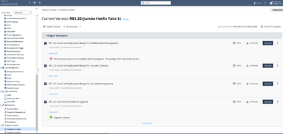
It would be useful only to see available packages you can actually use on the gateway. So if you are a firewall gateway, don't show management software, or if you are already on R81.10, don't show (blink) images for R81.10.
On my management gateway R81.10 I got this "surprise" message when I verified the R81.10 Gaia Fast Deployment Image for Security Gateway:
| The following results are not compatible with the package:nn - Machine's configuration is 'Multi-Domain Server'nnnThis installation package is supported only for Security Gateways.nThis installation package is not supported in cloud environments.nVSX open server.n This installation package may not be supported on your appliance model.nFor the latest software images, see sk120193. |
- Mark as New
- Bookmark
- Subscribe
- Mute
- Subscribe to RSS Feed
- Permalink
- Report Inappropriate Content
Very good point. I actually saw the same in my R81.20 lab.
Best,
Andy
"Have a great day and if its not, change it"
Andy
"Have a great day and if its not, change it"
- Mark as New
- Bookmark
- Subscribe
- Mute
- Subscribe to RSS Feed
- Permalink
- Report Inappropriate Content
If there is no functionality improvement I don't see a reason to switch to the new GUI. The old GUI provided more information in a smaller space with less clicking stuff. So, my vote is for the old interface.
- Mark as New
- Bookmark
- Subscribe
- Mute
- Subscribe to RSS Feed
- Permalink
- Report Inappropriate Content
The Event log is now hidden in Update Settings - not a good idea imho, had been soooo easy accessible before !
Makes no sense to have two tabs Available Updates / Installed Updates - one Software Updates window, smaller line height would be fine !
CCSP - CCSE / CCTE / CTPS / CCME / CCSM Elite / SMB Specialist
- Mark as New
- Bookmark
- Subscribe
- Mute
- Subscribe to RSS Feed
- Permalink
- Report Inappropriate Content
Hi,
trying to download the DA from https://support.checkpoint.com/results/sk/sk92449 it results in a 404
Trying to give feedback via 'Report this issue results in mail response
I'm sorry to have to inform you that your message could not be delivered to one or more recipients. It's attached below.
<support_center_feedback@michael.checkpoint.com>... User unknown (in reply
to RCPT TO command)....
So I assume you revoked this build 2297 ?
Regards
- Mark as New
- Bookmark
- Subscribe
- Mute
- Subscribe to RSS Feed
- Permalink
- Report Inappropriate Content
I just tested the link and it's intermittently working, keep trying or raise an SR with TAC to have them supply the file.
CCSM R77/R80/ELITE
- Mark as New
- Bookmark
- Subscribe
- Mute
- Subscribe to RSS Feed
- Permalink
- Report Inappropriate Content
Hello,
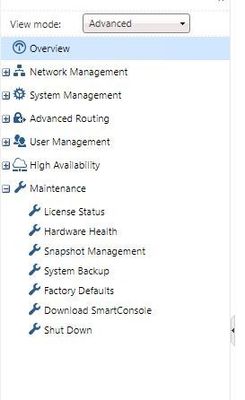
I switched the GUI to the new GUI. After that the Upgrades(CPUSE) section on the left hand side dssappeared.
I also logged out and signed in again. Nothing chanded. The only option now is the clish.
Any ideas?

Thank you.
- Mark as New
- Bookmark
- Subscribe
- Mute
- Subscribe to RSS Feed
- Permalink
- Report Inappropriate Content
Hi
Can you please contact me on boazo@checkpoint.com ?
Sorry but I hadn't encountered such issue so need more details in order to fix
Thanks
- Mark as New
- Bookmark
- Subscribe
- Mute
- Subscribe to RSS Feed
- Permalink
- Report Inappropriate Content
Same thing happens to me (using TACACS). I have case SR#6-0003731325 open but they haven't made much progress.
- Mark as New
- Bookmark
- Subscribe
- Mute
- Subscribe to RSS Feed
- Permalink
- Report Inappropriate Content
Hi, same issue here on one of our appliances. Has anyone found a fix for that?
- Mark as New
- Bookmark
- Subscribe
- Mute
- Subscribe to RSS Feed
- Permalink
- Report Inappropriate Content
Update: We found a fix for our case. We just noticed, that we had an issue on that appliance with the Gaia AAA RADIUS Super User UID setting and the RBA role setting. We got "Permission denied" warnings when logging into Bash. After fixing the Gaia Super User UID and the RBA Role settings the "Upgrades (CPUSE)" section for the new Deployment Agent/CPUSE is visible in the WebUI.
- Mark as New
- Bookmark
- Subscribe
- Mute
- Subscribe to RSS Feed
- Permalink
- Report Inappropriate Content
Saw it today while updating.
Didn't like the fact that can't see Deployment Agent version from the main screen, now it's burried in Update Settings.
Also during upgrade no more packing details where you could see each hotfix package installation. Now only an Installing update with percent.
Switched back to legacy interface for now.
- Mark as New
- Bookmark
- Subscribe
- Mute
- Subscribe to RSS Feed
- Permalink
- Report Inappropriate Content
It definitely takes some getting used to, but I like it 🙂
Andy
Best,
Andy
"Have a great day and if its not, change it"
Andy
"Have a great day and if its not, change it"
Leaderboard
Epsum factorial non deposit quid pro quo hic escorol.
| User | Count |
|---|---|
| 5 | |
| 4 | |
| 4 | |
| 4 | |
| 3 | |
| 3 | |
| 3 | |
| 3 | |
| 2 | |
| 2 |
Upcoming Events
Wed 13 May 2026 @ 11:00 AM (EDT)
TechTalk: The State of Ransomware Q1 2026: Key Trends and Their ImpactThu 14 May 2026 @ 07:00 PM (EEST)
Under the Hood: Presentando Check Point Cloud Firewall como ServicioAbout CheckMates
Learn Check Point
Advanced Learning
YOU DESERVE THE BEST SECURITY
©1994-2026 Check Point Software Technologies Ltd. All rights reserved.
Copyright
Privacy Policy
About Us
UserCenter


